
Spotify Redesign
This project aimed to enhance the user experience of the Spotify desktop version by simplifying navigation and personalization. The homepage was redesigned to allow users to customize their feed. In the "Browse All" section, content was organized by categories to reduce clutter, and the artist page was revamped with a top menu, collapsible albums, and customizable views for easier browsing.

Conceptual
Myself
User Research
Wireframing
Usability Testing
Figma
Duration
4 days
Problem #1
The homepage lacks focus and feels cluttered with unrelated content. While its goal is to serve as a marketing funnel, user behavior shows that music listeners are highly loyal to their preferences. As a result, the page—intended to feel like home—fails to create a welcoming and cohesive experience. Instead, it feels disorganized and disconnected.
Solution
Introduced the ability for users to customize their homepage by rearranging sections and adding new rows from their personal library. This way, users are empowered to create a more tailored and engaging experience, aligning the content with their preferences.
Problem #2
When users click on "Search" and navigate to the "Browse All" section, they are overwhelmed by a disorganized mix of random suggestions from various unrelated categories, making it difficult to find relevant content.
Solution
Organized the content by grouping suggestions under clear, category-based titles, providing users with a more structured and intuitive browsing experience.

Problem #3
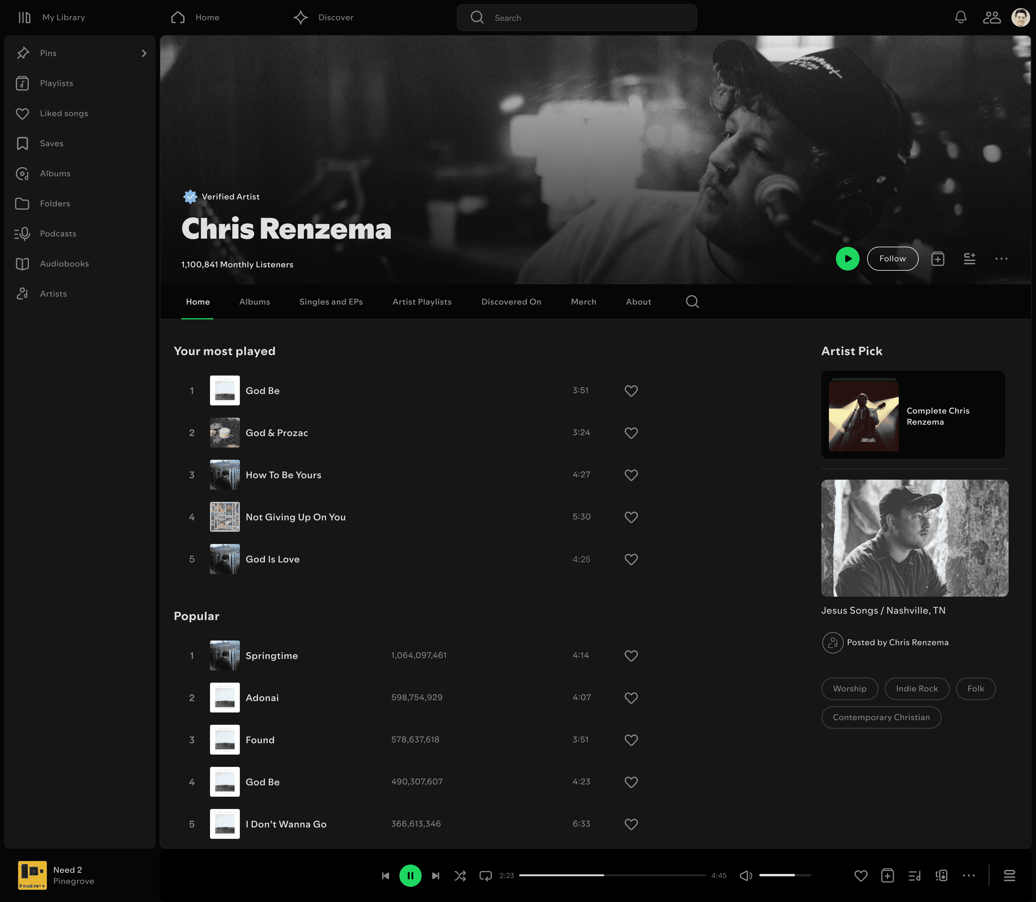
The discography section on the artist page is difficult to navigate. Users must click "Show All" to view all albums, which results in an overwhelming, lengthy page displaying both albums and songs. Although filters are available to assist, they are not enough to simplify the browsing experience, leading to frustration. The overall layout lacks efficiency and usability.
Solution
To improve navigation, I introduced a top menu with tabs for different sections. On the main page, instead of showing "Most Popular" tracks, I displayed the user's most played songs, allowing them to easily queue up their favorites.
I kept the "Artist's Pick" section, and added an "About" section with a link to the "About" tab.
In the "Albums" tab, users can now switch between a grid or list view. Albums are collapsed by default, providing a cleaner look and a more efficient browsing experience. This prevents the page from becoming unnecessarily long, making it easier for users to find their desired album. Additionally, I added a search icon within the tab, allowing users to quickly search for specific content.

Problem #4
User research showed that users do not want discovery song previews mixed in with their favorite tracks, as it disrupts their listening experience.
Solution
I introduced a separate discovery tab, along with swipeable categories for different genres. This allows users to explore new music without interference, and easily add songs they like to their playlists.

Branding
For branding, I retained the original font and logo, keeping the color palette similar to maintain consistency. My focus was primarily on improving the UX rather than making significant UI changes. The icon library was sourced from Figma as a free design resource.

Research
My research involved gathering feedback from friends who use Spotify, focusing on their complaints, suggestions, and desired improvements. I also analyzed other designers' Spotify redesigns and problem-solving approaches for further insights. I then organized all the identified problems in Miro and brainstormed solutions.

Conclusion
As a Spotify user, I enjoyed working on this project. Identifying user experience issues was easy, as the app has several areas that could benefit from UX improvements—of which I redesigned only a few. However, finding solutions to these problems was challenging at times.